Editorial Spread
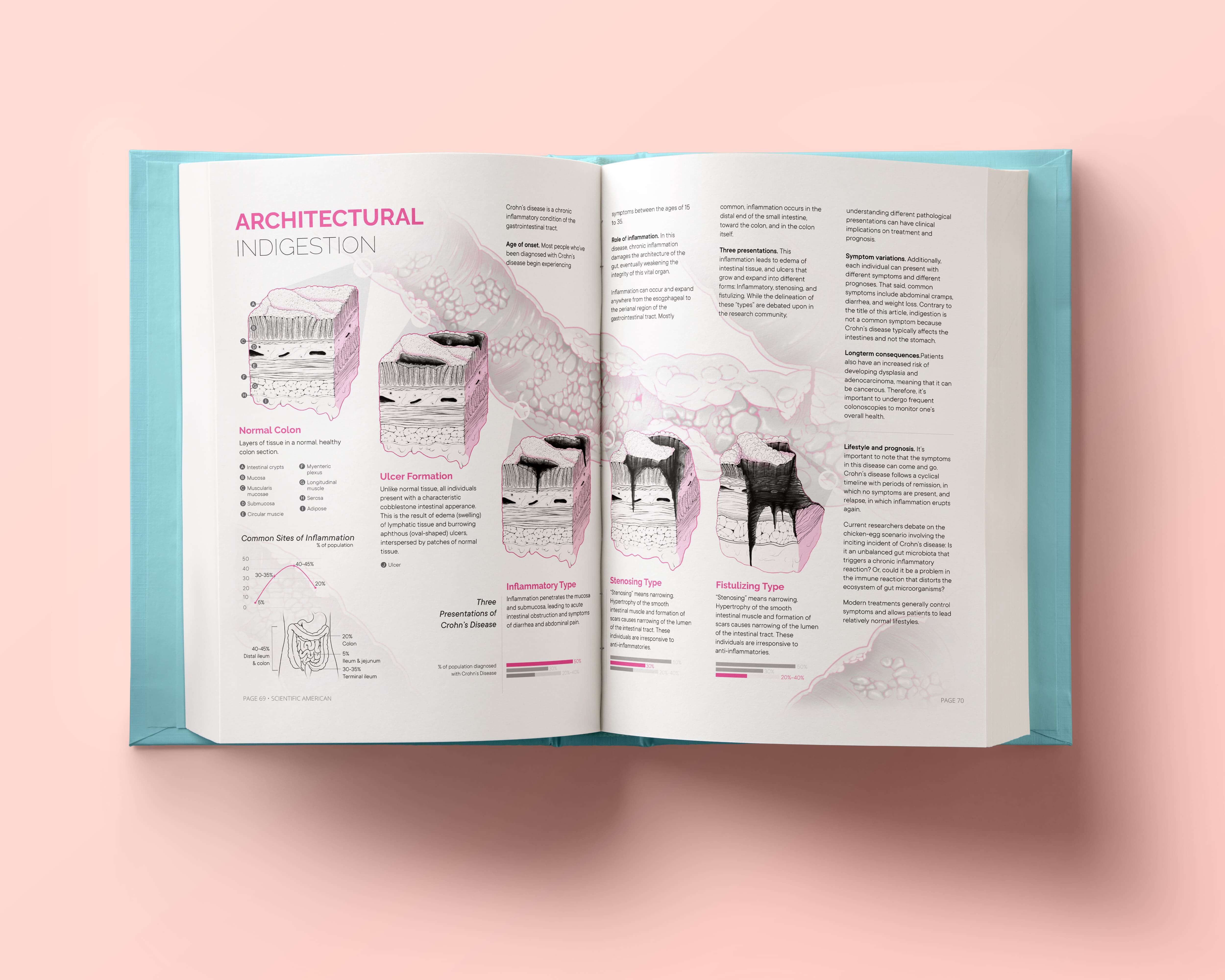
Architectural Indigestion
Dec 2020
Overview
A two-page magazine spread that investigates the pathological changes to gastrointestinal tissue in Crohn's disease, an inflammatory disease of the bowel.
Supervisor
Shelley Wall, Associate Professor in Biology and Biomedical Communications
Content Advisor
Dr. John Wong, Assistant Professor in Anatomic Pathology
Location
University of Toronto Missisauga
Department of Laboratory Medicine and
Pathobiology
Audience
General public
Roles and Responsibilities
Researcher, illustrator
Tools
Illustrator, Photoshop, Procreate
Challenges
There is a significant body of research on the aetiology, epidemiology, immunology, and microorganisms involved in Crohn's disease. With all of this research, one of the biggest challenges I faced was figuring out what story I wanted to tell. How much detail can I add without derailing the narrative? This consideration directly influenced the type of information I would include. It was important that the information was able to engage lay audiences, who may not have a personal or professional stake in learning about this disease.
Literature Review + Siloing Content
When I began this project, I didn't have a story in mind. This was my exploratory phase: I conducted a literature review from textbooks, primary articles, and health government pages on Crohn’s Disease. By investigating as much as I could about Crohn's disease, I was able to develop a sense of what constitutes as relevant and fascinating content to the general public, as well as what would be visually compelling to illustrate.

The beginnings of my research document for my visualization on Crohn’s disease.
Media Audit
One of my big concerns was how my project might contribute to the repository of
educational media on Crohn's disease. From analyzing existing illustrations of
Crohn’s disease, I discovered that most contained primarily text or did not
illustrate microscopic tissue changes.
This was a communication gap I could fill! These tissue changes can manifest in
different forms, which can change the course of treatment and the prognosis. The
pathological changes to gastrointestinal tissue is an important facet
of this disease.
Conducting a media audit shaped my science narrative. I wanted to provide readers an
insight into
the
microscopic tissue changes and how this can translate into large scale changes on
the
gut, particularly into the classic "cobblestone" phenotype.
Written Copy
I distilled my literature review into key points, then worked on textually conveying
these points in a clear and accessible way. At the same time, I sketched thumbnails
of potential layouts to check for text-image synchrony. During this process, I
recognized I lost a hold on the story I wanted to tell. There was so
much research I could
potentially illustrate. During critiques, my peers agreed and pointed out the
density of information, which made reading the infographic feel stressful.
So, what do I do? Do I make more spreads? Given the technical specifications of the
deliverable, I couldn't do that. Strangely, the words of Oki Sato, a designer, became a source of
inspiration. Go back to the beginning. So, that's where I went.
I
reviewed my initial media audit,
and tried to
verbalize the main message of the spread in a single sentence. If I couldn't do
that, then I would distill more of the information to figure out what the story was.
Coming up with a "take-home message" made it easier to silo through the research,
thumbnail sketches, and layouts to choose the clearest
communication method.
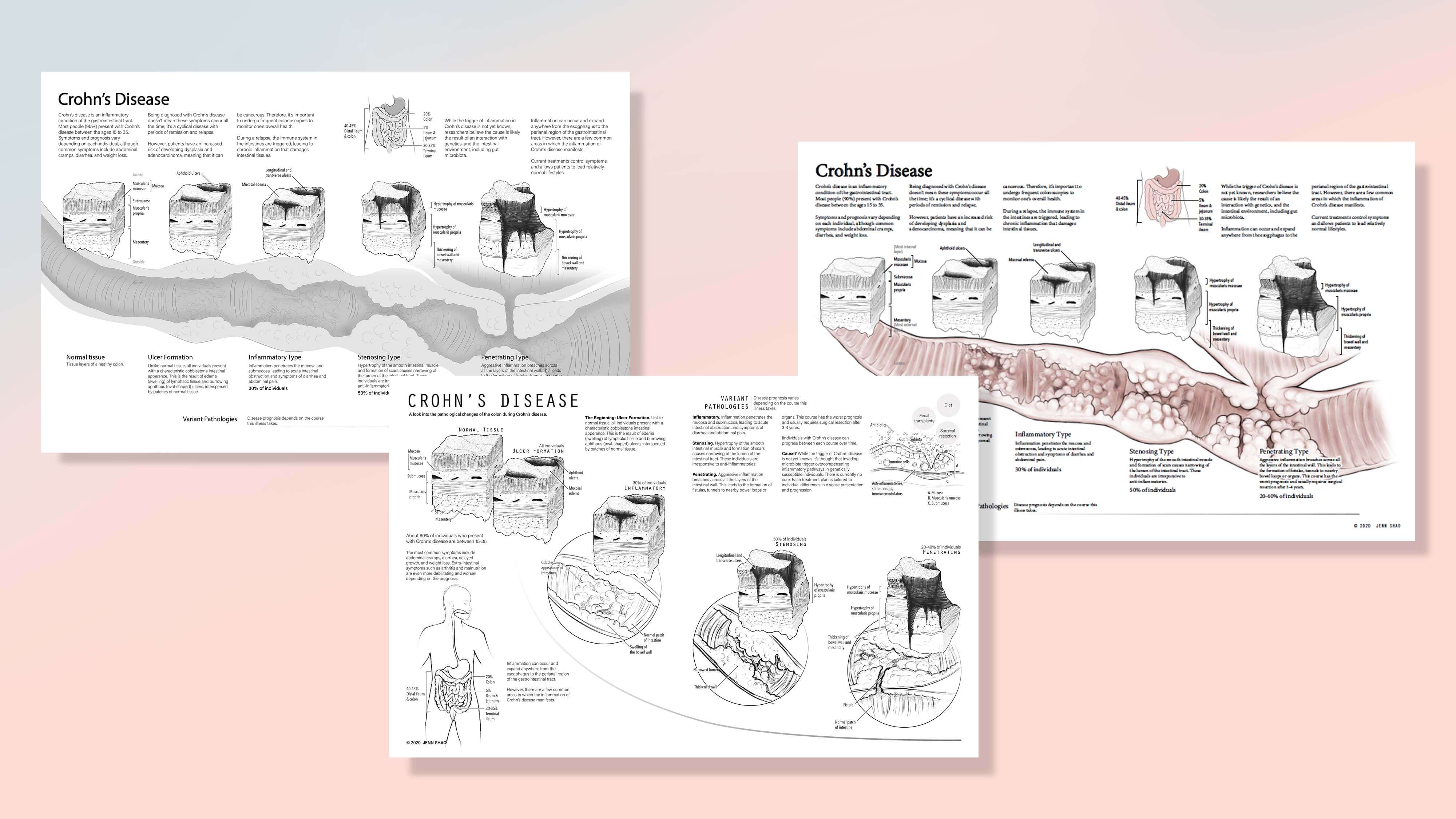
I went through so many thumbnails! These are just a select few.
Tissue Cube Study
The focal point of the spread was tissue cubes that show the microscopic spatiotemporal changes to the gastrointestinal tract. This brief exercise helped me understand the pathological changes and begin to develop the visual aesthetic.
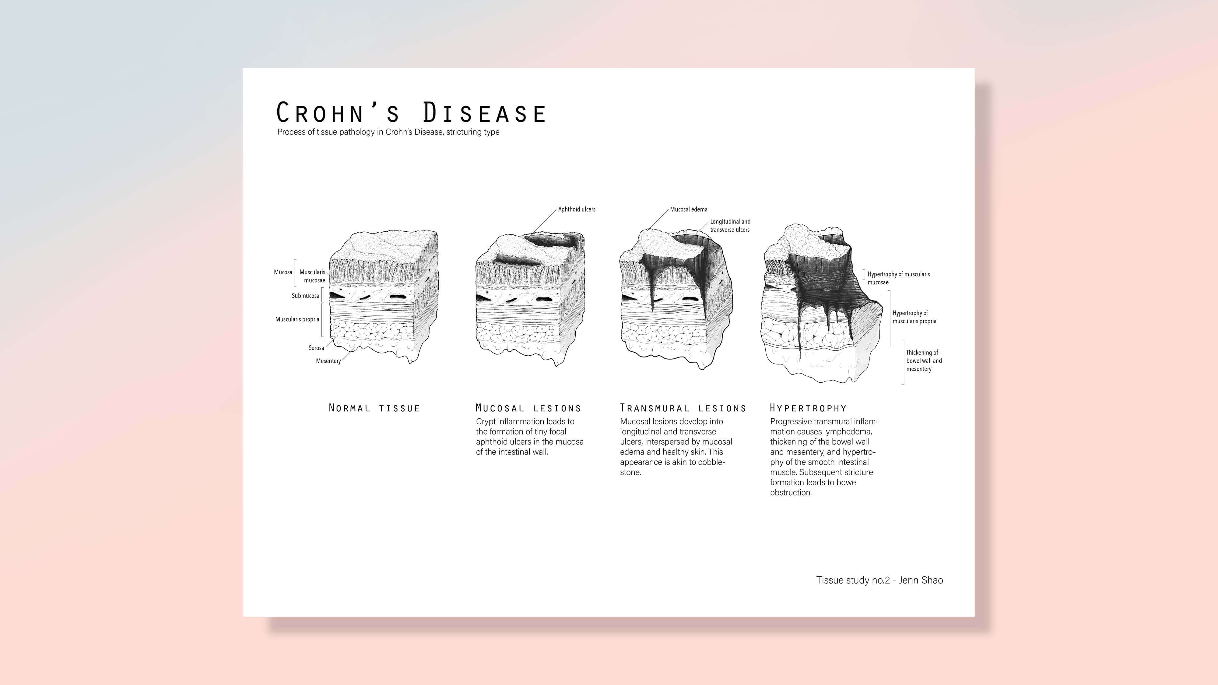
Tissue cube study.
Moodboard
I was inspired by clean and elegant UI styles and the work of a
medical illustrator who rendered this blood-brain barrier infographic in primarily
linework. These sources of inspiration helped me figure out how to turn my lines
into something more clean and elegant.
I decided to use a single accent colour and promote the linework.
This was to highlight the complex structures and pathological changes in the
gastrointestinal tissue, which would be lost if I fully rendered the piece. I chose
pink for its calming effect. This stylistic choice was to
balance out the intensity
of the linework and data.
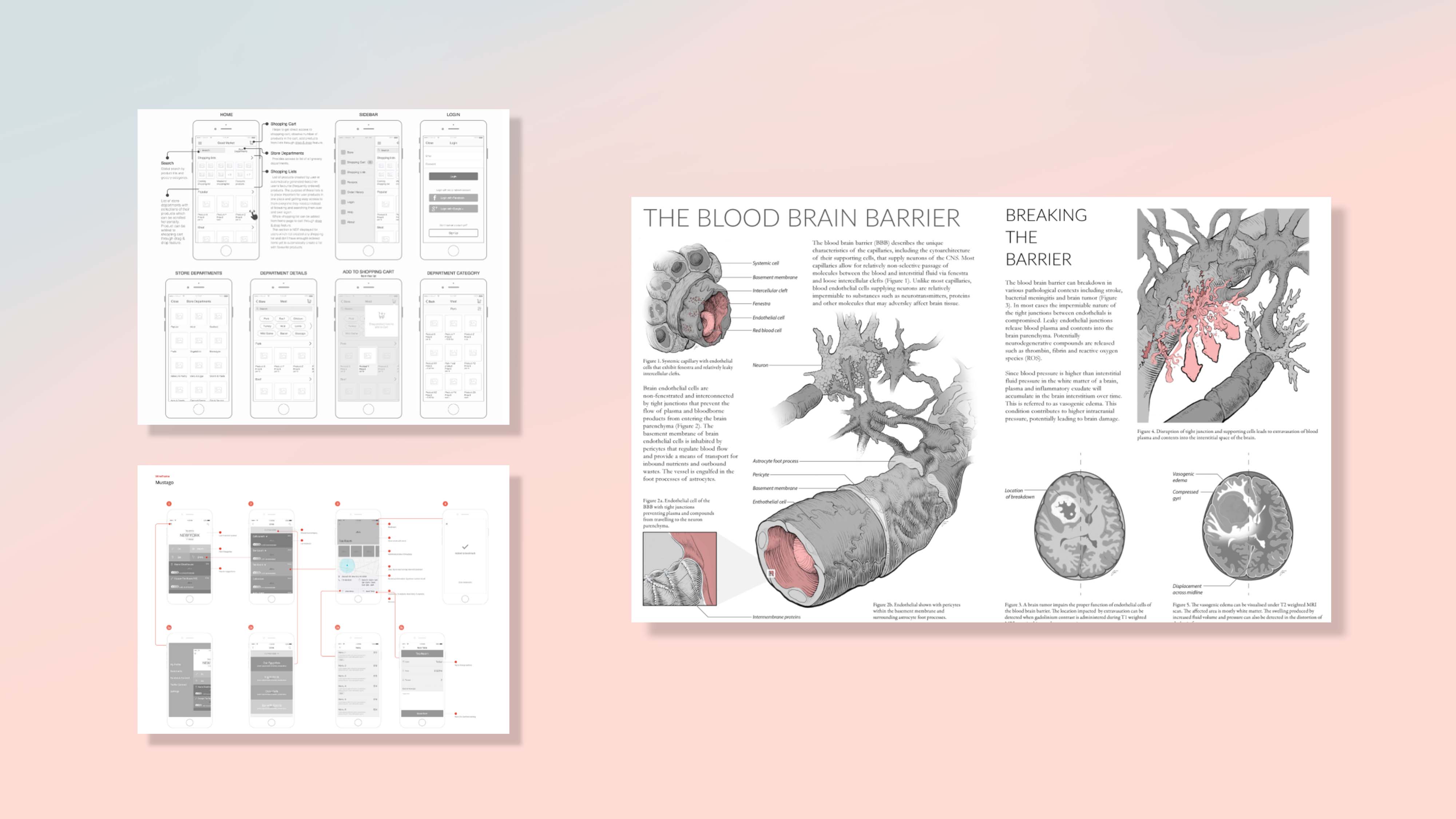
Inspirational pieces—I love a clean UI!
Production Workflow
There were three components in the production pipeline: Rendering pathological changes to the gross anatomy, refining the gastrointestinal tissue cube study, and designing data visualizations to pull the narrative together.

Workflow. More to come.
Final Comprehensive
My completed spread of the work.
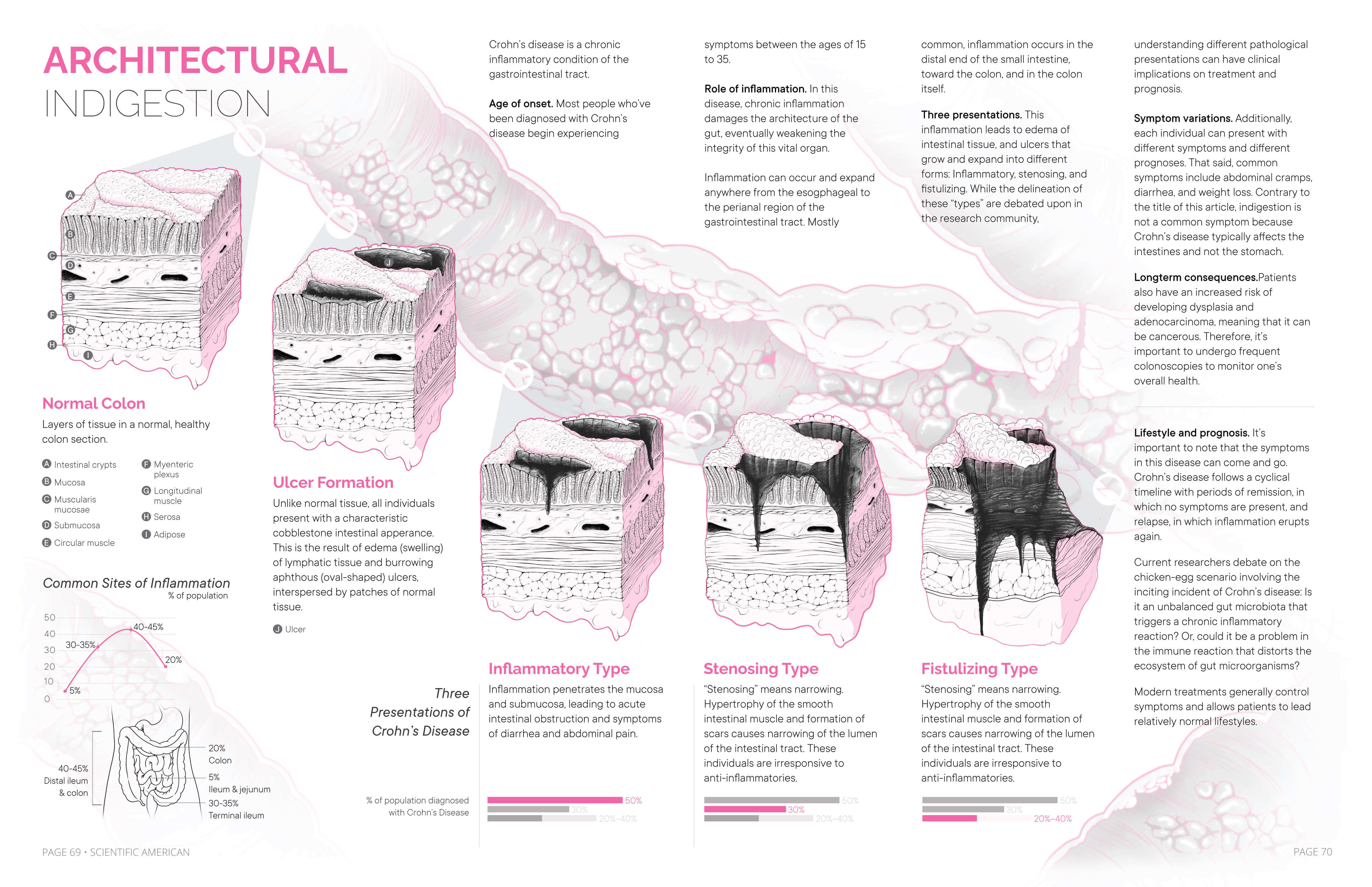
Final comprehensive illustration.
Reflection
I adored working on this project because I was able to practice my linework. I was
also to exercise a more minimalist style, and I learned (once again) the value of a
rapid-iterative approach.
I would love the opportunity to conduct more
thorough user research before constructing this piece.
Acknowledgements
To Shelley Wall and our mutual love of rabbits! Thank you for your guidance and kindness. To Dr. Wong and his insight and recommendations for the content and design.
Works Consulted
Here is my bibliography (PDF). It includes images, links, and anything else I found constructive in my research. Feel to reach out about any resources and if you have any questions!