Don't Kill Your Neighbours• In progress
November 2021–Present
Overview
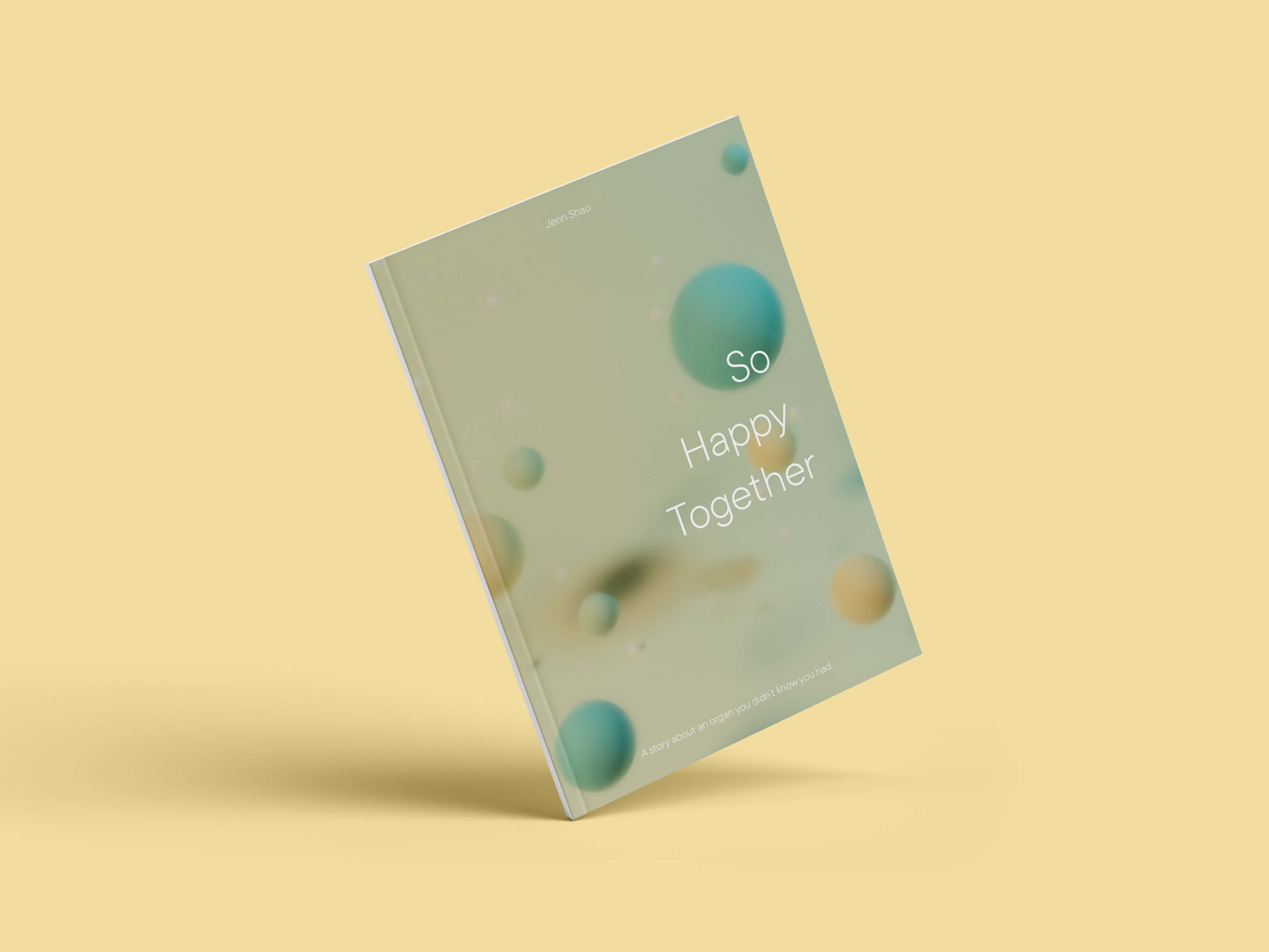
You forgot an organ! A data story about your gut microbiota.
Supervisor
Nicholas Woolridge, Associate Professor in Biology and Biomedical Communications, University of Toronto
Content Advisor
Dana Philpott, Professor and Associate Chair of Research in Immunology, University of Toronto
Location
University of Toronto Missisauga
Audience
Educated lay public, university students
Roles and Responsibilities
Research, storyboarding, science content, illustrator, 3D modeling
Tools
Illustrator, Photoshop, Procreate, InDesign, Blender, Figma
Communication challenge
The first few years of life represent a critical period of development for the gut
microbiota. It forms a mutually
beneficial
partnership with you, so much so that it's considered an organ in the human body. By
engaging
with the environment, functions
that are vital to your lifelong health
are established. But this isn't something the average person knows.
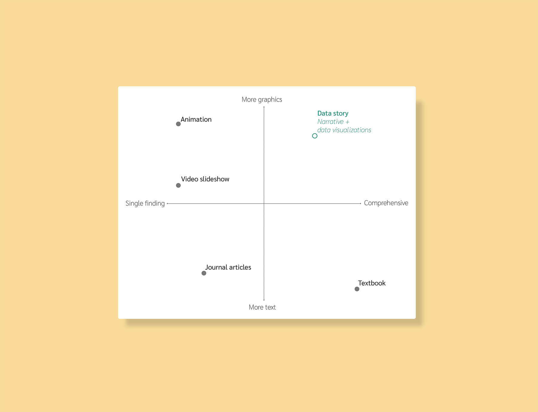
Most
communication tools take the form of animations, or didactic reports or
textbooks,
each frought with their own limitations.
Existing aimations can only provide a general overview
or a specific aspect of this relationship; they cannot illustrate
important complexities. Journal articles
are exhaustive but contain technical jargon that is too complex for a lay
audience,
and even university students to understand.
There does not yet exist a tool
that
acts as a happy medium that scaffolds the complexities of this phenonmenon in an
accessible way.
Proposed solution
Bridging this communication gap requires connecting research findings with the people and lives that they represent. Storytelling is a powerful form of rhetoric that can do just that. The goal of this thesis is to develop a data story about the growth and development of the gut microbiota.
How this thesis fits into the reservoir of communication tools
Objectives
- Construct an engaging narrative that acts as a mental framework for scaffolding data and broadening myopic perspectives
- Develop multi-layered data visualizations to illustrate complexities in this relationship
- Promote transparency in both the research communicated and the data visualization workflow
- Develop accessible visualizations
- Refine design skills and 3D modeling skills
Project management
I held weekly meetings with my committee to touch base and gather feedback. I used Clockify to track my hours. My project timeline will be uploaded soon!
User research
Utilizing secondary user research to mitigate misconceptions
I often feel that the optics of science research are negative and
alienating. What are scientists talking about now? Why are they always
changing their minds? Does it have anything to do with me?
Keeping this in mind, I researched existing studies and compiled a reference
document for misconceptions about the
microbiota and about
science in general. The purpose of this secondary user research was to guide the
narrative,
ensuring I don't perpetuate these misconceptions, and instead effect change in these
attitudes. A more formal user survey is in development from these results.
Information design research
Mindmapping relevant areas of research in information design
This project represents my interest at the intersection of information design and science research. I had a lot of fun learning more about information design! One book I loved reading and would highly recommend is the Data Visualization Handbook by Juuso Koponen and Jonatan Hildén.
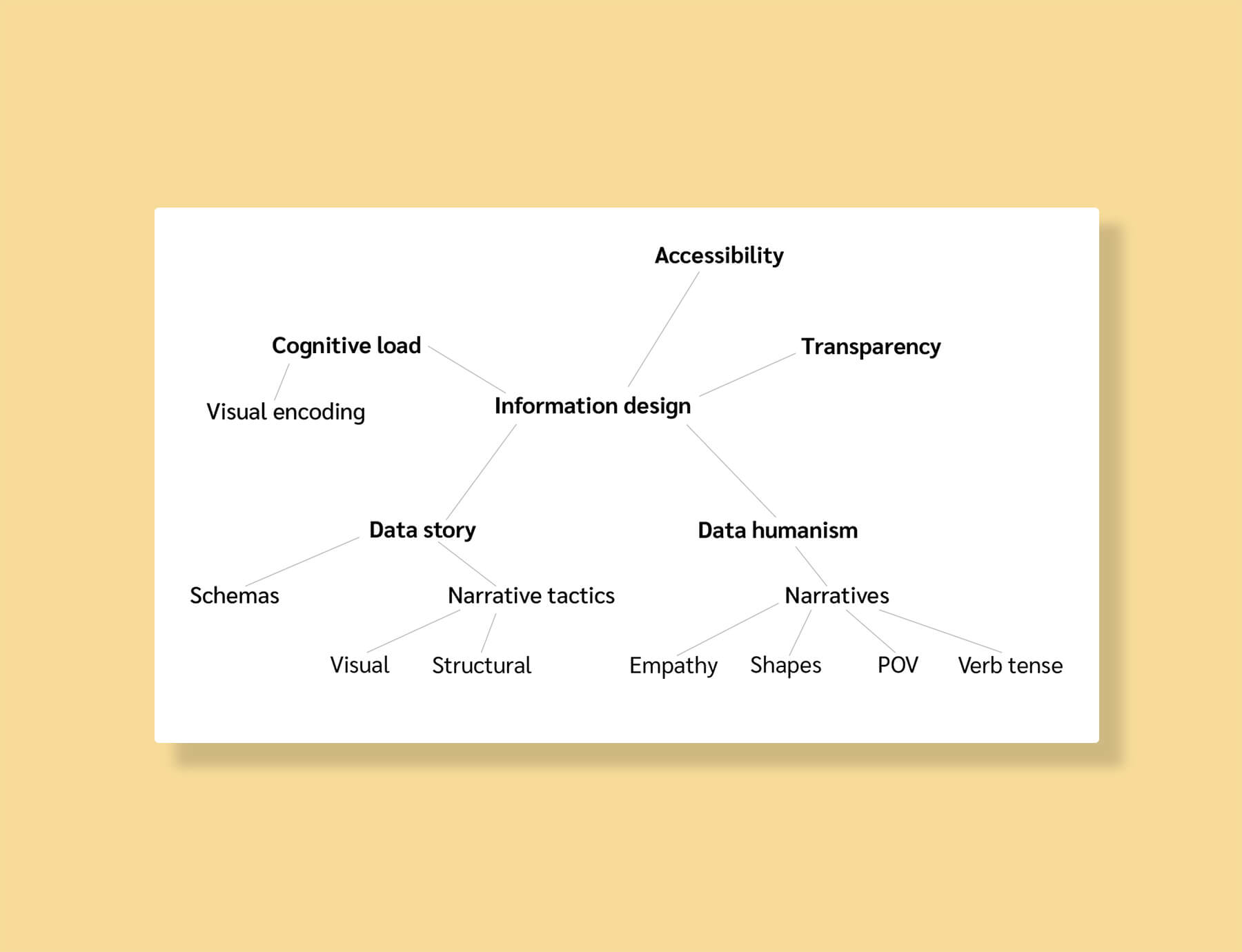
Overview of my review of information design as a communication tool
Science content research
I
began this project with little knowledge of the gut microbiota. The most challenging
aspect was making sense of
the research and prioritizing sub-fields of study.
To resolve this issue, I
first
made an outline of potential content and a preliminary narrative that I shared with
my committee. It was a rapid iterative approach with several rough documents that
could be easily discarded and changed. I worked closely with my content advisor to
limit the scope of the research, navigate controversial points and uncertainties in
the field, and figure out the relevant pieces of knowledge to translate for the
general public.
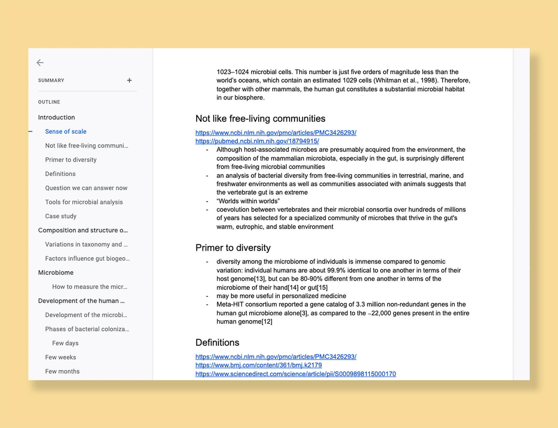
Google document of all gut microbiota research
Developing the narrative
Visual outlining to develop the "big picture" of the story on the gut microbiota
Research and writing was recursive. Whenever I got stuck writing, I would return to
the research and see that it was due to a lack of content or a lack of
understanding. The problem with this approach was that it was inefficient and I'd
lose sight of the scope. What I
needed was a stronger vision of the big picture of the story.
Here's what helped me make sense of what I wanted to communicate: I made a map. I
wrote down the main topics (i.e. the headings) from my research document on sticky
notes and arranged them in different story shapes. I asked myself: What would be
an effective
beginning? What is the big idea that I want to return to, or the take-home
message?
Having to physically move around the "ideas" and see the story try on different
flows in a rough but incredibly flexible format created a much more effective
outline—it was essentially a map. A digital, clean version in Figma is forthcoming!
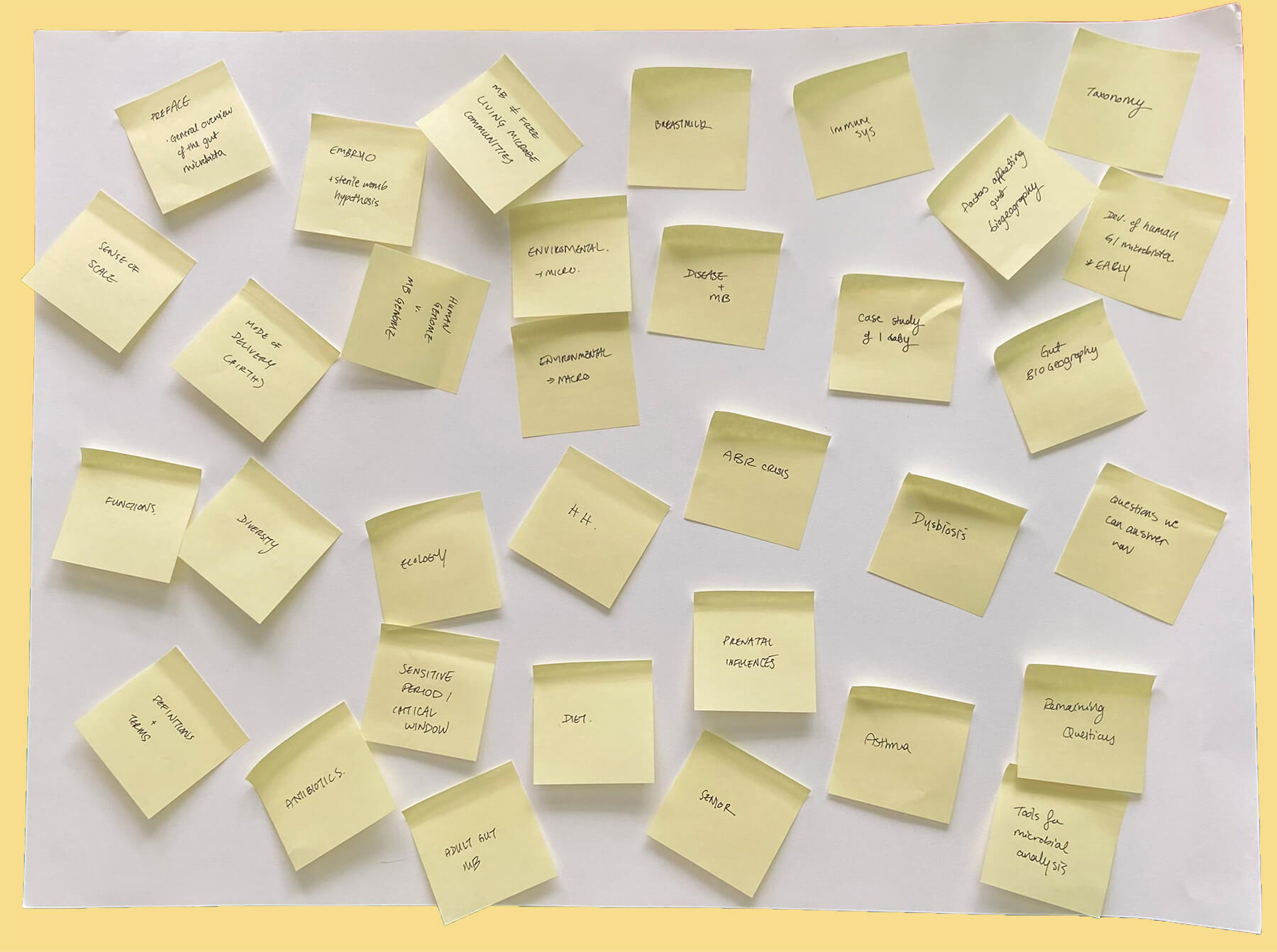
Scattered stickies as I begin visual outlining.

Figuring out the "flow" of the narrative
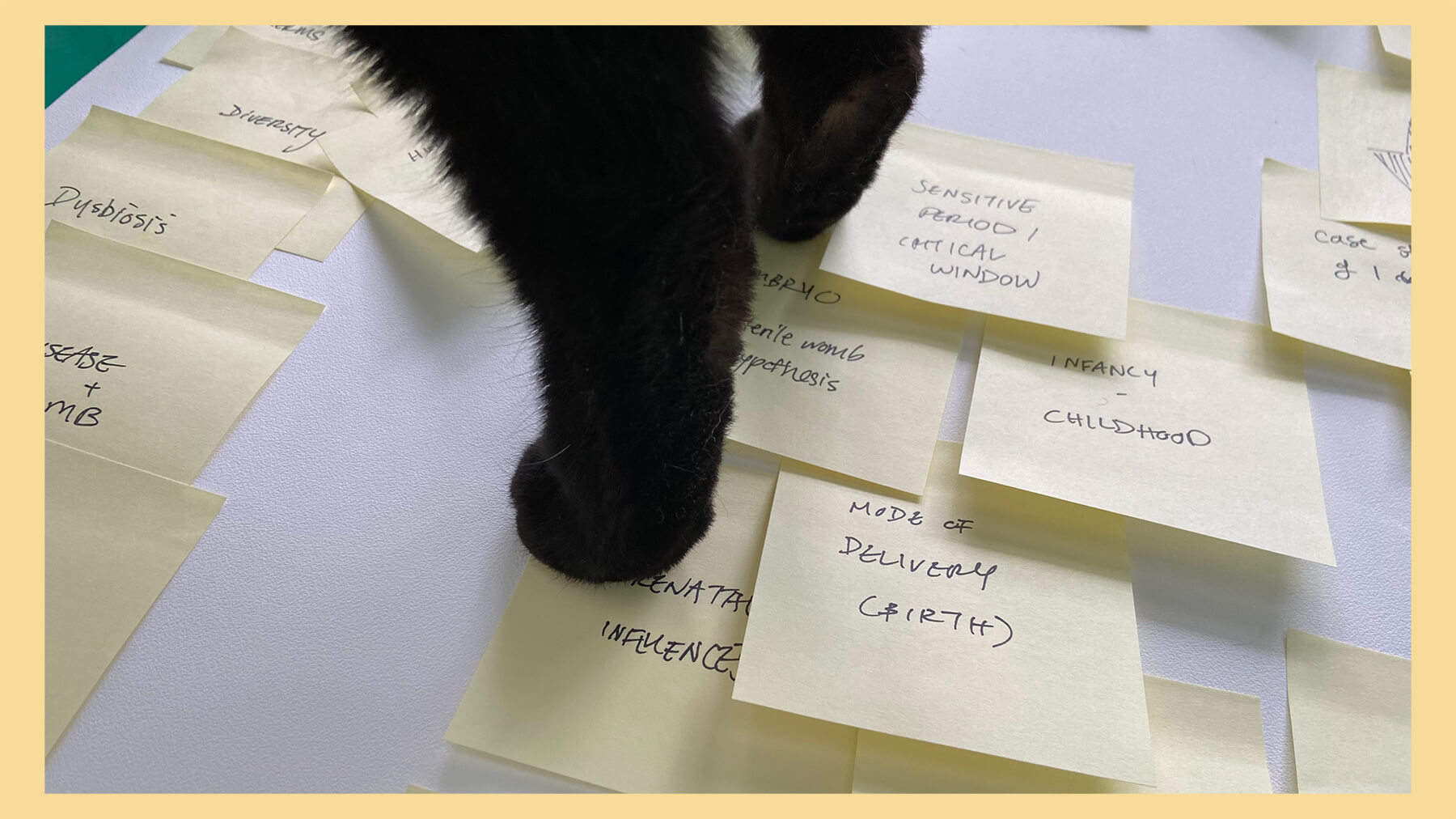
One of my cat's making a special cameo appearance. This is research assistant Bibi!
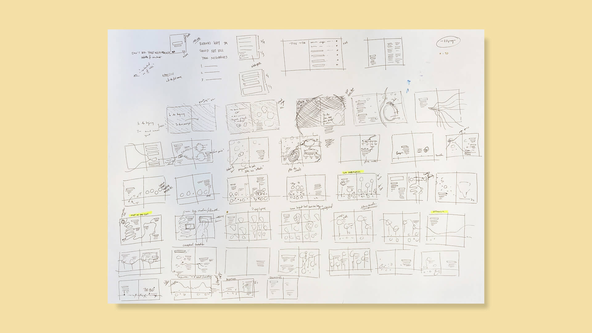
Rough storyboard
Next steps
My next goal is to create a cohesive draft with text, visuals, data visualizations. Last updated: Mar 1, 2022